Friday, 15 April 2011

Task C: A line is a dot that went for a walk

This is my final design for assessment task C, this comes from muy own inspiration about creating an images that expresses me as an artist. There are two different dragon faces on my artwork, the red face dragon is the bad one and the green face dragon where he is sending a message saying ' I will find you lafa'. The theme is about two different side brothers are facing each to get redemption. I have use Photoshop to design this artwork and using different effects tools such as the Gradient tool, fitlers, colours swathes and blending options by playing around with different effects by choosing the colours and effects that adapts the best. I've used as many colours to create like a comic style image, choose colours that suits the dragon face. Also used two different  text Fonts on the top saying 'King of Dragons' as the name of the theme and on the message line that follows towards circle speech saying 'I will find you LAFA'. This  represent the dot and the line.     

Started to sketch the face of the green dragon first.


Then went on creating its  teeth, make it look of a angry impression.


Then went on sketching it's eyes.

Then I started sketching another face dragon which is the Red one.


Then I went on sketching his teeth and tongue.


Sketching his nose by make it look evil.

Sketching his evil eyes by make it into a tiger type eyes.

Then I went on sketching these little face gold balls that is used on top of his head.

Skteching the eyerings both sides and a leaf on the right side representing his symbol.

Then i went on sketching three cigaretts.


Finally i have finished sketched my final design of the bad face dragon.

Finish my final sketch of the good face dragon.

CD Cover part 2

 
This is my final CD cover part 2 that I've design on Photoshop. This is same DJ artist that i have used on my first CD Cover so i have to changed the style, font and the colour of the Cover, try to look different appearance. To design this CD Cover, i have used different tools such as Gradient tool to created a tone and contrast colour, I used the gradient to create it shading tone colour at the background and also on the DJ person. I decided to place the logo on the back cover and i also used the gradient to create both colours at the same time. At the back cover, I started play around with the grey part by looking into a spikey appearance and make it funky. The text I've used is the Fat Boy graffiti font that i have download it and placed on both on my CD cover.Then i used a other font for the writing part of the back cover.   


The name of the font i used for the DJ Pato is 'Fat boy graffiti' Font.

I've also used the Fat Boy graffiti font for the text.  

I have sketch the DJ Pato logo on my visual diary.   

I have sketch the back cover of the CD by using a fineliner at the end.

I have sketch the front cover of the CD by using a fineliner at the end.

Friday, 1 April 2011

Music Packaging CD Cover

This is my final work creation of my CD Cover which display a my friend's DJ artist name DJ Pato in Spanish which means DJ Duck in English. I've used Photoshop to design and create my CD Cover to played around with different tools and effects to get the colors and pattern that it want. Firstly i colours all the different layers all my CD front and back cover by using the paint bucket tool to colour it. Secondly when i finished with the colours, i move on by doing different effects and patterns to make my CD cover look realistic and abstract looks by going into filter and used artistic,sketch, stylist and texture by make it look profession. The effects I've used are Mosaic tiles for the blue part, ocean ripples and sprayed strokes for the red part and yellow part and i also used Fresco for the orange part, i played around the contrast and texture such as the brightness and darkness of the colour and effect to make look good. thirdly, I started on my colours for the little DJ guy and also used filter to make this effects which i used neon glow. The lastly i move on placing a photo digital of my DJ friend onto the left corner of the back cover and also copy the DJ guy image else. The text font i used are Planet benson for my headings and for list of tracks i used orator std text font.                                 


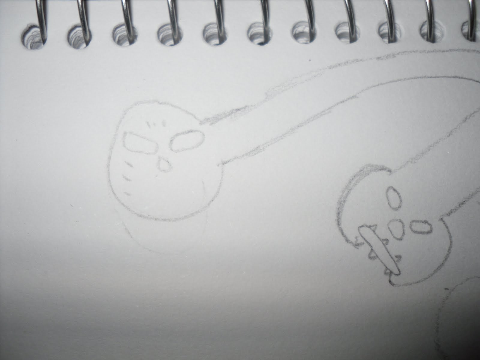
1. Design of the my font CD cover sketched on a visual design and used fine liner to trace liner

2. Design of the back CD cover playing with different  abstract fire types lines.


3. Playing around with the top heading and adding "UR" to make it look cool and interesting.  

4.Then after it was sketched on my visual diary i used the fineliner to trace it.