Question One- Formal and Informal design
Formal
Balance - They are well balanced with the images and text, well positioned together as one artwork.
Rhythm - The rubbish font are repetitive with the same image with text inside the rubbish bags, but the cd cover and the dot is an line that went for a walk does not have any repetition.
Proportion - On the CD cover, the dimension is well viewed, it looks realistic but also create a little bit of 3D such as the World in the middle.
Dominance - The third assessment (the dot is an line that went for a walk) creates dominance towards the background behind the butterfly but they are well position together. The cd cover creates a bit of dominance with the dark colour background, they are well effected together.
Unity - The three assignment all have relationship between the individual part because they are different in terms of the elements, they are well position and close to one another.
Informal
Closure - The three assignment doesn't have any missing pieces in a composition, all the element are formed as one artwork.
Continuance - The three assignment are contunance to look in a direction by looking at the look first and then the background.
Similarity - The CD cover has a bit of similarity with the world in the middle and the other on the top right corner as both are created in different size and colour. Also with the shiny circle of ET of the bottom right corner and the shiny circle behind the featuring text, both very similar in different sizes.
Proximity - All three assignment have a relationship will all the colours, contrast, tone of the images and text are well connect together especially with the third assignment.
Alignment - The three assignment, all objects are well line up, pefectly straight and well balanced especially with the rubbish in which creates a pattern to every second letter.
Question Two: Concept appropriate for informal?
I think that informal is an appropriate concept to map out different stages of the design such as their techniques, skills and knowledge.
Question Three: Improvements
The only critical thing that I had with the third assignment (a dot that went for a walk in a line) is the tone effect from the background and text. I think that the background should be a bit more brighter and the text should be a bit more lighter with the white colour and maybe a bit of shadow towards it but otherwise a great design.
Question Four: SWOT
Strengths: All three assignment are well produced in terms of techniques that he use toward the designs. The structure of the design are well effective with balances, colours and the composition is well positioned.
Weaknesses: Maybe used a bit more tools on photoshop, don't make too complicated, make it simple.
Opportunity: The opportunity is to work hard, sticking to the plan with precisely to achieve a great design.
Threats: Brainstorm and map out all the development and ideas onto a visual diary showing the progression of the design.
http://all-you-need-to-know-about-lucas.blogspot.com
Monday, 23 May 2011
illustration with a social conscience


The topic i chosen is Envirnomentalism, thniking these two advertisement can adapt people to protect any disease from the rubbish out of the environment from every community that is happening in Australia.
Target Audience: The target audience that I intended to advertised these advertisement is generation Y at the aged of 16 to 24 years who seem to be littening more rubbish in the environment than other generations.
Message: The message is simply keeping the natural environment clean, safe and tidy from pollution.
The two different is designed on photoshop by playing around with tools to get the colour, contrast, texture, fonts and also use blending options to create effects for the background and texts. Also intend to use different type of brushes such as having the plants and leaf shaped and brush it around the background so it looks more of a environment theme with green dark and light colours. I have intended to take photos outside my house by putting rubbish on the grass so it doesn't look obvious.
Photos
 |
| Took a angle shot of the rubbish outside my house. |
 |
| Took a medium shot of the other small rubbish pile. |
 |
| Used my right hand to pick up the rubbish that was left in the grass and placed in a bin. |
Storyboard- (Hans Christian) The Candles
 |
Scene 1: Introduction of the story, Close up shot of the wax candle that is placed infront of the windows inside the house. There is a music playing during the scene. The time goes for 5 seconds. Scene 2: Medium shot of the candle standing on a dark brown table with a person's hand intending to grab the wax candle. The time goes for 6 seconds Scene 3: Close up shot directed towards the wax candle and his friend the tallow candle (skinny) that gives him advice in the kitchen, they are both having a conversation. The time goes for 4 seconds Scene 4: Extreme long shot, a lady from the house is grabbing the wax candle and give it to a boy to delivered to the Religious poor house family. The time goes for 5 seconds. Scene 5: Close up shot, the boy is walking along with his basket with the wax candle with full of potatos, music is playing while his walking. The time goes for 6 seconds. Scene 6: Wide angled shot, the same boys went to deliver the wax candle placed inside the house infront of a woman with three childrens. The time goes for 5 seconds. Scene 7: The end of the story, Medium shot, the wax candle is lighted in which it wanted with the family saying a pray during the evening. There are also his friend the tallow candle was also been sent to the family poor house. The time goes for seconds. Story - The Candles by hans Christian This is story of a big wax candles who attentionally wants to be lighting in a silverstick. His old house that he lived wouldn't light him so he took advice from his fellow candle friend tallow candle and then he decided to attend to a religious family where they are looking for a wax candle to used with their prayers. Final Storyboard   This is the story that i've sketched on a A4 paper and then use a fineliner to trace over it. Then went to used photoshop to create the colours of each scene of the storyboard as the final work. In the storyboard, each scene will have a descrption of different angles shots, timeframe and some scene will have music during the story. |
Sunday, 22 May 2011
Design Brief on Explode Fitness Gym Center
Design Brief – Explode Fitness Gym Center
Aim
As part of the Explode fitness gym center company, our aim is to provide all overweight males and females to stay in a lifestyle that is involved in maintaining full fitness, energy and healthy position for their body. We decided to design an advertisement to demonstrate to all people to begin training and exercising as soon as possible to keep their body fit at all times during winter period. This is one important aspect of people lifestyle to start thinking about the future towards them and making the effort represented themselves as one healthy human being attracted and living healthy in a few years time. This is keep people involved in leisure activity and participating in a sport fitness gym, getting into shape, eating healthy protein and nutrient products and exercising at least four to five days a week, this gym is open 24 hours every day. This gym is also include of consumers that has the potential to attend any leisure activities in which included, yoga and boxing classes.
Target Audience
As part of the explode Fitness gym company, our target audience is mainly directed at middle aged potential consumers around the aged of 18- 34 years old who need to stay in a healthy position and tone up their body into shaped to all overweight consumers all around Australia. We intended to target at that specific audience by searching on the Australian Bureau of statistics website which show the amount of people are living in a bad lifestyle habit in the last five years are in trouble living in a non healthy habit and we as the company will need to improve their motivation to participate and adapt into this gym fitness exercise experience.
The message
Our message is showing energized and self belief towards the consumer to have some sort of confidence themselves by doing it. This advertisement will help changed their mind into a different perception and perceived confident towards their ability to stay in a healthy lifestyle position that they will never experience before of their entire life for all overweight consumers. The advertisement that we will be producing will create an attention to the middle aged people, males and females and get them to experience with their own habit of not sitting in the couch for the whole day, eating unhealthy food, not taking care of their own body, letting them drop into a zone where they can’t train forever. This is our time to demonstrate to all unhealthy people to start training and exercising by attending at our convenience 24 hour Explode gym fitness center. Our singled minded message that needs to be placed on the advertisement is ‘Fitness that makes you feel good’
This is a fitness example pictogram that we be used in the gym, by showing different ways of training and exercising at Explode Fitness Center.

Budget
We have allocated for the designer to produce the Explode fitness gym center advertisement by have an allocation of$5 million to be spent on research, a design of the logo, message towards the target audience and computer programs that will be used to design this advertisement. The budget will also require the designer to sketch different images of the advertisement and ideas before incorporate all together in the final stage of the process.
Timeframe/schedule
We expect the research findings and design layout of the advertisement to begin around mid May 2011 with the entire requirement such as information and ideas that been collated. All findings and ideas must be approved by the director of the company (Explode fitness gym center), the advertisement must be finalized and must be completed on the 8th of August 2011. We need the information and ideas by this date to coincide with our expectation of the advertisement to be launched and so that all findings must be executed and any necessary changed can be made. The final due date for the advertisement to be presented appropriate to the director of the business is on 7th of September 2011.
Sunday, 15 May 2011
Bottle Advertisement

This is an advertisement of a bottle that I've designed on photoshop CS5. On photoshop, this is to demonstrate on how to used different tools that i've never used before. This advertisement requires different element and tool to get effects of colours, contrast, texture, shape, size and shadows. The difficulties that i had with this bottle advertisement is the background theme when i couldn't know how to duplicate all these theme in one canvas.
I also have difficulties with the rainbow shape where i could get the transformation of the wrap in a right position so I just play around at times until I get it correctly. Overall, I think that I have done a good job and get many experiences of using different tools. The most fun part of this bottle advertisement is the bubbles on the background, I think the appearance looks so realistic by using the soft eraser tool to create a grow look.
Heart Simple Vector on Adobe illustrator

This is a heart that is design on adobe illustrator CS4 program. I basically used the ellipses tool to sketches two big circles at the top and one small circle at the bottom. Then went on to used the line tool to sketch at the bottom of the two big circle and form it into a upside down triangle shape with two small line underneath the small circle. Then I went Window and choose pathfinder and divide all the shapes together. Then i went on to choose the colour I want for the heart and chose red and used the pathfinder to merge the shape together to form into a heart.
Rainbow motion
This is my video motion of a rainbow with a guy moving together as one motion. Firstly I begin to design the rainbow by using photoshop. The tools I've used to produced the rainbow in photoshop is just rectangle tool by making them look all the same appearance size and shape. Then choose the five different colours for the rainbow and used the circular selection tool to create the shaped like a rainbow. Then I've duplicated the layers and go to transform from Edit to make the size of the rainbow and appearance of the rainbow.
Then when i finish designing the rainbow, and started to make a text to go with it which says REMIX. I move on to a different program where you can make a small video which is called Motion. Firstly i grab the dancing guy and placed him in the middle and make the background black. Then went to try out different tools to make the effect of the background and then placed the rainbow and text towards it by making them look more interesting.
Friday, 15 April 2011
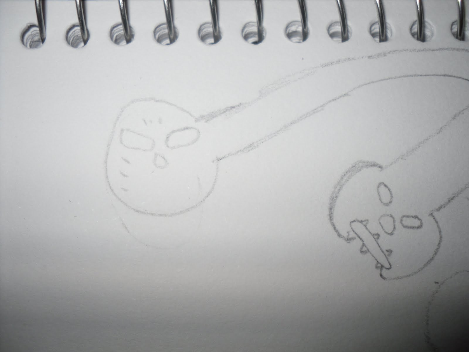
Task C: A line is a dot that went for a walk
 |
| This is my final design for assessment task C, this comes from muy own inspiration about creating an images that expresses me as an artist. There are two different dragon faces on my artwork, the red face dragon is the bad one and the green face dragon where he is sending a message saying ' I will find you lafa'. The theme is about two different side brothers are facing each to get redemption. I have use Photoshop to design this artwork and using different effects tools such as the Gradient tool, fitlers, colours swathes and blending options by playing around with different effects by choosing the colours and effects that adapts the best. I've used as many colours to create like a comic style image, choose colours that suits the dragon face. Also used two different text Fonts on the top saying 'King of Dragons' as the name of the theme and on the message line that follows towards circle speech saying 'I will find you LAFA'. This represent the dot and the line. |
 |
| Started to sketch the face of the green dragon first. |
 |
| Then went on creating its teeth, make it look of a angry impression. |
 |
| Then went on sketching it's eyes. |
 |
| Then I started sketching another face dragon which is the Red one. |
 |
| Then I went on sketching his teeth and tongue. |
 |
| Sketching his nose by make it look evil. |
 |
| Sketching his evil eyes by make it into a tiger type eyes. |
 |
| Then I went on sketching these little face gold balls that is used on top of his head. |
 |
| Skteching the eyerings both sides and a leaf on the right side representing his symbol. |
 |
| Then i went on sketching three cigaretts. |
 |
| Finally i have finished sketched my final design of the bad face dragon. |
 |
| Finish my final sketch of the good face dragon. |
CD Cover part 2
 |
| This is my final CD cover part 2 that I've design on Photoshop. This is same DJ artist that i have used on my first CD Cover so i have to changed the style, font and the colour of the Cover, try to look different appearance. To design this CD Cover, i have used different tools such as Gradient tool to created a tone and contrast colour, I used the gradient to create it shading tone colour at the background and also on the DJ person. I decided to place the logo on the back cover and i also used the gradient to create both colours at the same time. At the back cover, I started play around with the grey part by looking into a spikey appearance and make it funky. The text I've used is the Fat Boy graffiti font that i have download it and placed on both on my CD cover.Then i used a other font for the writing part of the back cover. |
 |
| The name of the font i used for the DJ Pato is 'Fat boy graffiti' Font. |
 |
| I've also used the Fat Boy graffiti font for the text. |
 |
| I have sketch the DJ Pato logo on my visual diary. |
 |
| I have sketch the back cover of the CD by using a fineliner at the end. |
 |
| I have sketch the front cover of the CD by using a fineliner at the end. |
Friday, 1 April 2011
Music Packaging CD Cover
 |
| This is my final work creation of my CD Cover which display a my friend's DJ artist name DJ Pato in Spanish which means DJ Duck in English. I've used Photoshop to design and create my CD Cover to played around with different tools and effects to get the colors and pattern that it want. Firstly i colours all the different layers all my CD front and back cover by using the paint bucket tool to colour it. Secondly when i finished with the colours, i move on by doing different effects and patterns to make my CD cover look realistic and abstract looks by going into filter and used artistic,sketch, stylist and texture by make it look profession. The effects I've used are Mosaic tiles for the blue part, ocean ripples and sprayed strokes for the red part and yellow part and i also used Fresco for the orange part, i played around the contrast and texture such as the brightness and darkness of the colour and effect to make look good. thirdly, I started on my colours for the little DJ guy and also used filter to make this effects which i used neon glow. The lastly i move on placing a photo digital of my DJ friend onto the left corner of the back cover and also copy the DJ guy image else. The text font i used are Planet benson for my headings and for list of tracks i used orator std text font. |
 |
| 1. Design of the my font CD cover sketched on a visual design and used fine liner to trace liner |
 |
| 2. Design of the back CD cover playing with different abstract fire types lines. |
 |
3. Playing around with the top heading and adding "UR" to make it look cool and interesting.
 |
| 4.Then after it was sketched on my visual diary i used the fineliner to trace it. |
Sunday, 27 March 2011
Title Sequence
This is my attempt on how to make an animation move with three basic tools to create a title sequence movie. Basically i used a text font "Title Sequence" and two shapes to move around by using a timeframe underneath where you can allocate how many minutes or second you can move your shapes and text. The timeframe went for 5 seconds long and created a small animated theme for practices only.
Sunday, 20 March 2011
3D Repousse

This is my first attempt of how to make the font and image a 3Dimensional shape with a shadow on photoshop CS5. I have used the Gradient tool to effect the colour dark and light tone. Basically used my name Jorge and a square shape to create the shadow and the light.
Wednesday, 16 March 2011
Assessment one - Rubbish font

This is my design of my rubbish font that i used on adobe Photoshop program. I've created my own alphabets fonts that says "rubbish" by sketching out onto a small visual design before i began to photoshop this font. The tools that i used in photoshop to develop and design this rubbish font are basically blending options, polygonal lasso tool, magic wand tool and a little bit of sharpen tool that I have used to play around with the rubbish font. Firstly i opened up the two files with the rubbish font sketch and the rubbish theme that I taken a photo off.
So i used the magic wand tool to drag the rubbish font onto the rubbish photo theme and basically used the polygonal tool to cut around the alphabets one by one straight and perfect, it was cut onto rubbish theme layer. Then used the magic wand tool to place all the alphabets into the right position which says ' Rubbish' font. Secondly, i started used blending options and played around with different effects to show which styles stands out the most. I want my font to look a bit of a 3D appearance and show the shadow around each of the alphabets. Then lastly, i created to two basic arrows underneath and below the rubbish font that creates a bit of a background so it doesn't look plain.
This is steps that i used to create the rubbish font by sketching, scanning and taking photos.
 |
| 1. Sketch my own rubbish font onto a small visual diary. |
 |
| 2. I used the fine liner pen to trace the alphabets. |
 |
| 3. I started to sketched into a 3 Dimensional shape with the alphabets. |
 |
| 4. Then I place the visual diary on scanner . |
 |
| 5. Then took a photo digital image of my recycling bin with rubbish. |
Sunday, 6 March 2011

Subscribe to:
Comments (Atom)